week 06
- Feb 17
- 3 min read
Critique
Color
look back on pitchdeck, color got away from you
shot 1/3 transition is too long
shot 3
the way the ring catapults looks weird, should be more natural
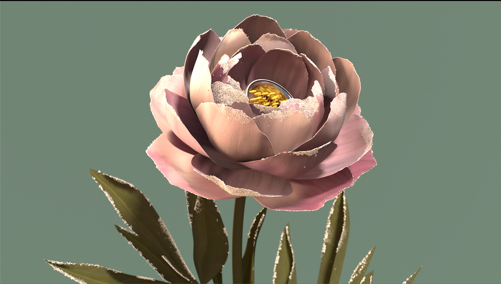
extra vellum sims to make the flower feel more natural
shot 2
add water caustics/light rays
shot 4
cloth animation was better before
shot 5
the yellow doesn't work
Color, color, COLOR!
The very first thing done this week was to fix the color pipeline! Although I had tried out a ACES pipeline, I figured we should go back to what had worked before– linear. In a perfect world I would figure out the exact proper pipeline for ACES, however it was more important to get the color working properly again, so In some way I had to cut my losses. I want to go back and solve this issue, though it's very low priority at the moment and would mostly be for my own learning.
My team hadn't noticed it until the mentors pointed it out, but we were focusing so much on the animation and cameras and FX, that we totally forgot to keep track of our color!
Very quickly we had a team meeting and went back to our original pitch deck to look at our marketing research of color. We had strayed so far! We put Gracie Szymanski in charge of creating our new color guideline, as she had a clear understanding of what we needed to do, and within a day she had made this PDF:

Overall Palate

Shot 3

Shot 2

Shot 4
I hadn't realized how useful this would be until I had started color correcting and I had overlayed the guide in the nuke viewport as reference. It definitely helped me stay on track.
Before/After of each main shot:

shot 2 week 5

shot 2 un-comped

shot 2 comped

shot 3 week 5
shot 3 un-comped

shot 2 comped

shot 4 week 5

shot 4 un-comped

shot 4 comped
The difference can really be seen with the continuity quilts!

Week 5 Continuity Quilt

Week 6 Continuity Quilt (comped)
Shot 2 is likely the most complicated shot, as there are separate passes for the lighting above the water and below the water that I stitch together. Normally this has been easily achieved by a simple roto for a few frames, however this week I ran into some matte issues in the alpha channel. My current theory is that the motion blur causes the rendered alpha layer to be slightly off, so there's a slight matte line in the comp. This is only visible for a few frames, however I'd rather figure out how to fix it. I managed to temporarily fix it by slightly eroding the alpha, however this isn't a great fix to the problem. I expect I'll have to sit down with Max Jokinen and figure this out together, or do my best in comp.

Close up of visible matte line

Close up with alpha overlay in red
The second challenge with shot 2 is integrating the render pass of the god rays. When I first slap comped them in, they stood out a bit too much, and seemed very out of place, and it's very easy to see their point of origin.

I decided to add more rays in comp, and luckily I had already tested them last week! My main issue last week was that alone they looked weird, and their point of origin was also wrong. When looking at the shot again, I realized I could key the highlights in the water's surface, and use those as the point of origin for the god ray node to start from! That way they're also a lot more physically accurate as well!
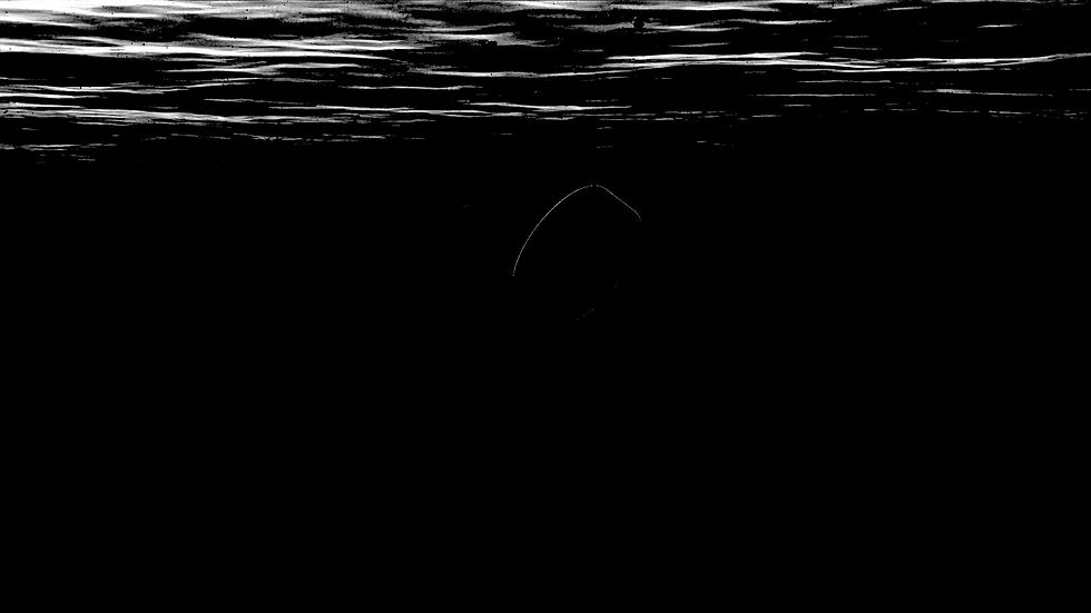
Keyed highlights of surface water

Post god ray node

With the ray render layer added

Still of final comp
The final effect is very subtle, however it moves a lot. For next week, I'd like to slow them down while also making them a bit more visible.
